Memoory: Social Video Platform
Memoory is a crowdsourced video creation platform for millennials. The project required a complete redesign of the existing app, starting from a full UX audit through user testing, persona development, and iterative design sprints. The goal was to rise above the social media noise and create an engaging creative content sharing experience.
Mobile App Design, UX/UI
Rebranded and redesigned Zipstrr, a seed-funded social video app, into Memoory: one product story from welcome screen to brand mark.
- Role
- Lead Product Designer
- Team
- CEO, CTO, lead developer, volunteer testers
- Timeframe
- Several design sprints across multiple months
- What I owned
- User research, wireframing, logo and brand, UI design, and the design system.
Problem · Solution
Stand out in a crowded feed without asking people to relearn how to post.
Problem: a seed-stage video app has to feel instantly usable, yet distinct enough to justify a download. Most entrants win one and lose the other.
Solution: borrow the interaction model from Snapchat and Instagram, then carry the difference in the brand and design system. Familiar to operate, unmistakable to look at.
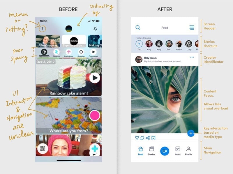
UX audit
Audited the existing app before redrawing a single screen.
Walked every screen in the shipped Zipstrr build, then tested the findings against early user sessions and a design critique: keep the recording stack, rebuild the rest.
Qualitative
Personas drawn tight around one millennial segment.
A broad audience makes for safe, forgettable calls, so we narrowed to one segment and let the personas decide the trade-offs: what the first feed shows, which gestures earn a slot, what ships in v1.
Methods
Research first, then wireframes, then pixels.
Surveys and interviews sized the demand, testing checked it against behavior, and wireframes kept the arguments in grayscale instead of a finished comp.
Welcome
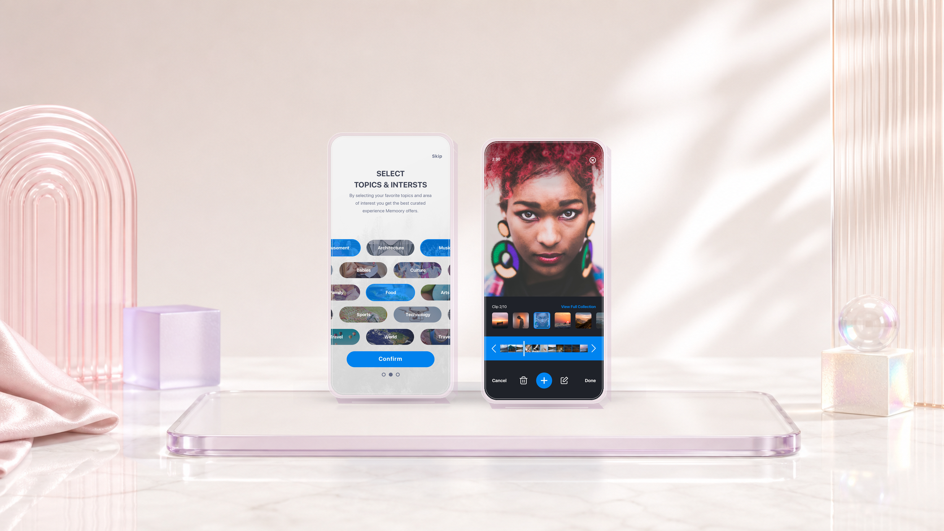
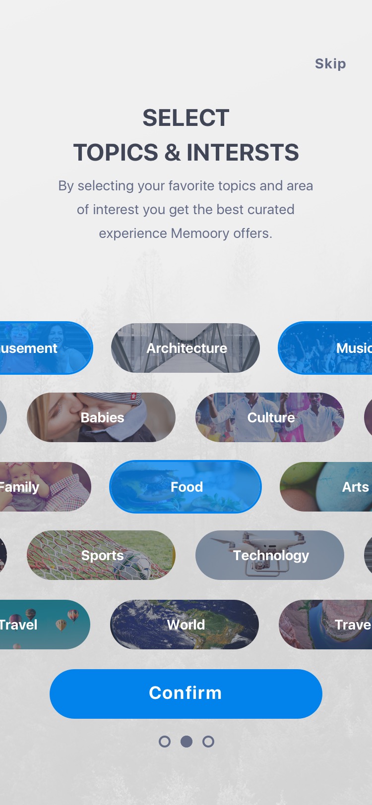
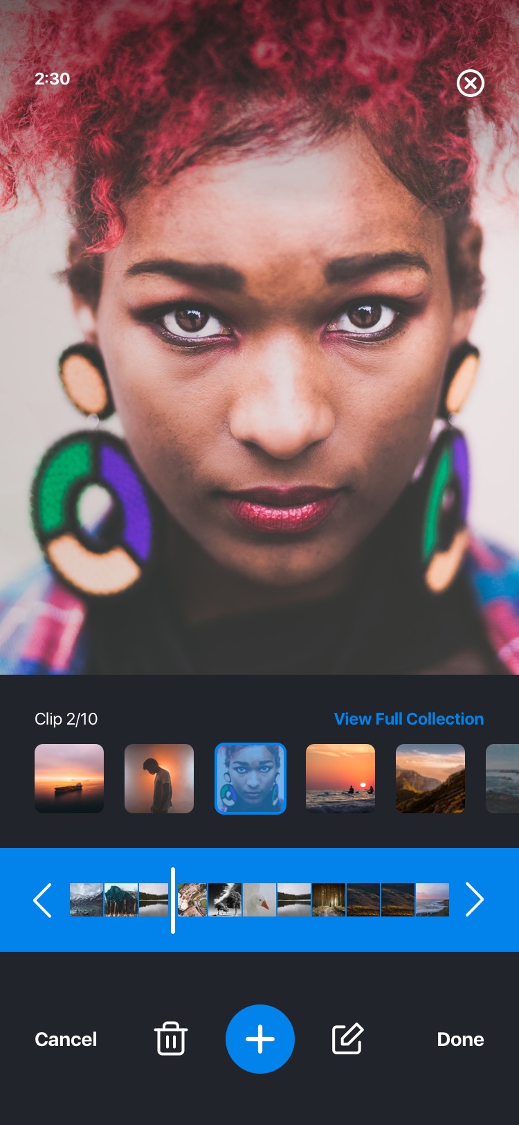
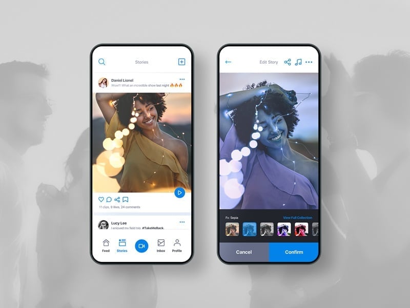
Pick topics on welcome. Record in one tap.
The welcome screen asks for a few topic interests, so the first feed lands with content instead of a blank wall, the same logic Pinterest uses to skip the cold start2. Quick-record then captures in one tap with a control people already recognize. No new gesture to learn before the app has earned the trust1.
Final result
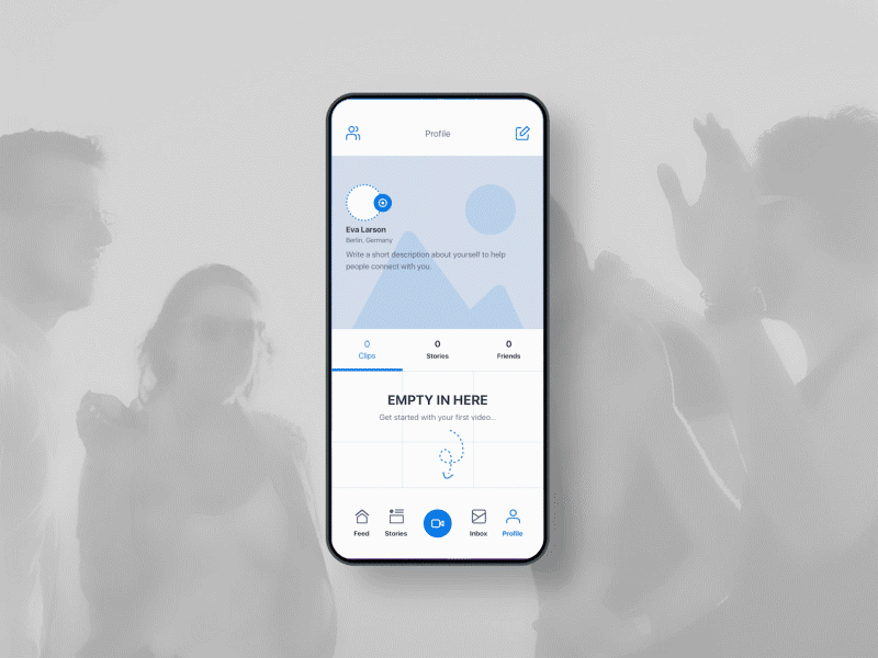
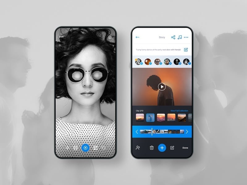
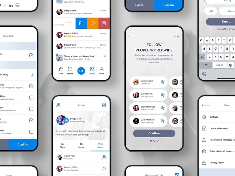
The surfaces that shipped.
Topic selection
Recorder
Overview
Feed
Event feed
Capture
Shared event
Discovery
Moments
Wrapping up
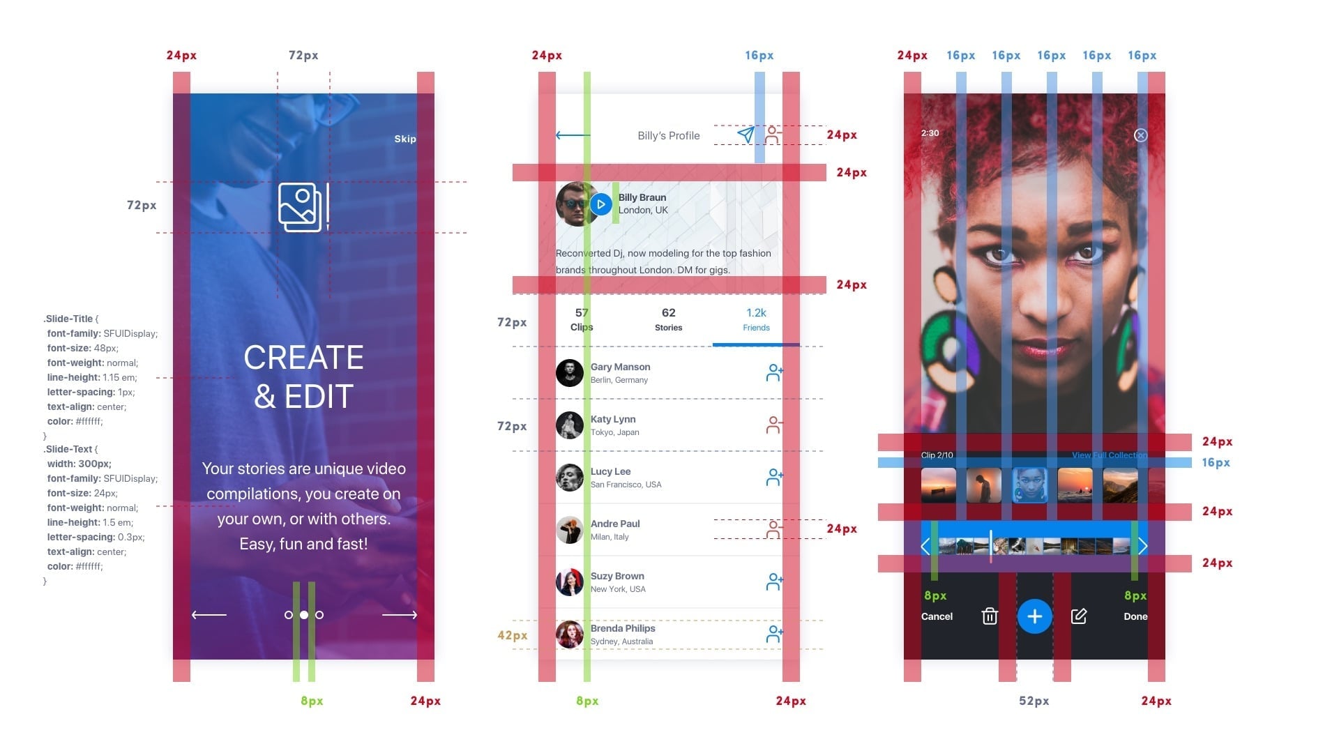
The system that holds it together: specs, icons, logo, swag.
The brand was the differentiator, so it shipped as a system, not a mood board: build-ready specs, one icon set, the logo exploration behind the mark, the app icon, and the merch that carried it off-screen.
Next pass
I would have spent the merch week on the empty feed.
Two more months
The mugs and shirts were launch goodwill, and they did their job in the room. But that week would have paid back harder against the first-session empty feed, the moment a new user decides whether to return. Consumer products rarely die at the feature. They die quietly at the cold start.
- Tidjane
Shipped with
Sources
- 1
Apple Human Interface Guidelines, Onboarding: keep first-run short and lean on gestures people already know. A novel gesture at launch is friction the app has not earned yet.
developer.apple.com
- 2
Andrew Chen on the cold start problem for social products: make the app useful to one user before the network arrives, so the first session is not an empty feed.
andrewchen.com
More work
Other projects worth a look.