Memoory: Social Mobile App
I redesigned how people discover, record and share stories, bringing Memoory's navigation, screens and visual identity into one system.
- Mobile App
- UX/UI
- Brand Identity
- User Research




Project overview
Overview
Navigation, recording and sharing in one social app
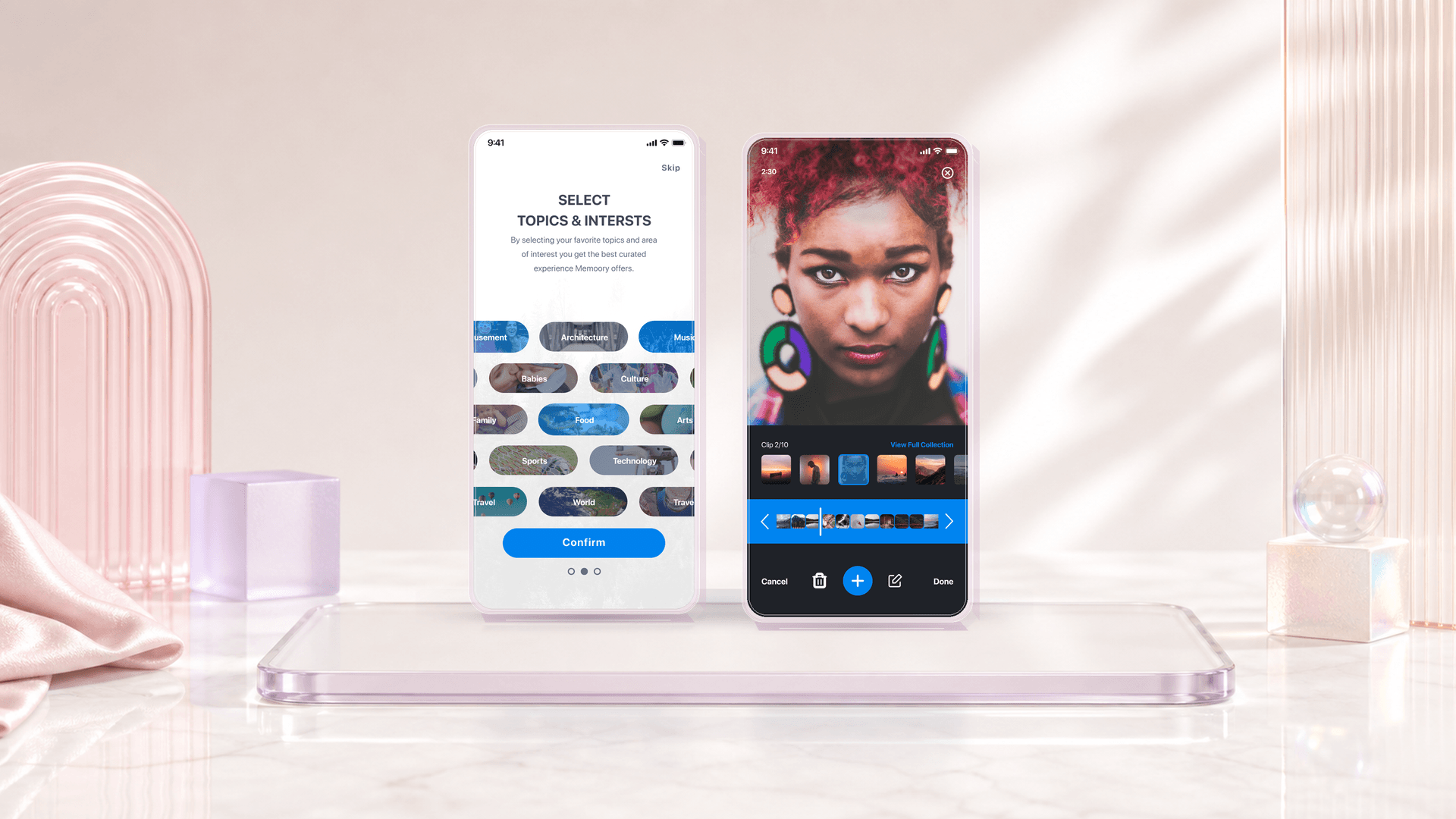
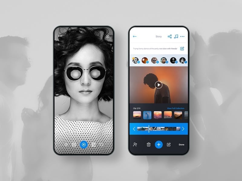
Redesigned the seed-funded social app Zipstrr as Memoory, connecting onboarding, recording, and collaborative video creation.
Role
Lead Product Designer
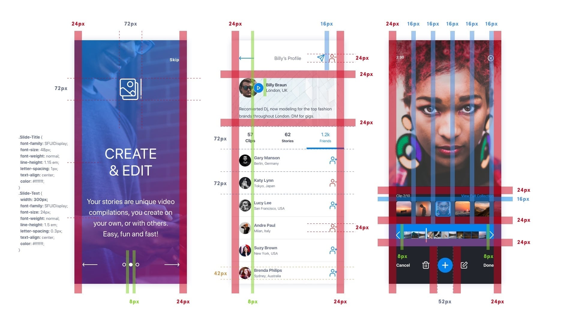
User research, wireframing, logo and brand, UI design, and the design system.
Team: CEO, CTO, lead developer, volunteer testers
Problem
Too much to learn before recording
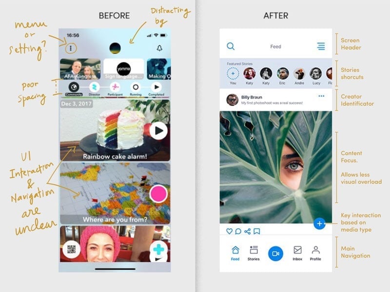
Zipstrr combined recording, group projects, messaging, editing, and publishing. New users struggled to understand these features before recording a clip.Solution
Start with a clip, grow into projects
Use familiar social navigation, introduce features gradually, and distinguish recording from collaborative projects. A new brand system connected the experience.

Auditing the existing app
People creating videos around shared events


Study setup and supporting material
- respondents
- 7
- test screens
- 23
- prompts per screen
- 5
- median response window
- 1h 30m
Supporting archive: 131 final UI exports, 45 wireframe states, 23 test screens and 10 flow maps.
Testing the core flows

Start

Topics

Feed

Projects

Project edit

Recorder

Inbox

Messages

Player

Profile
Three design principles
First action
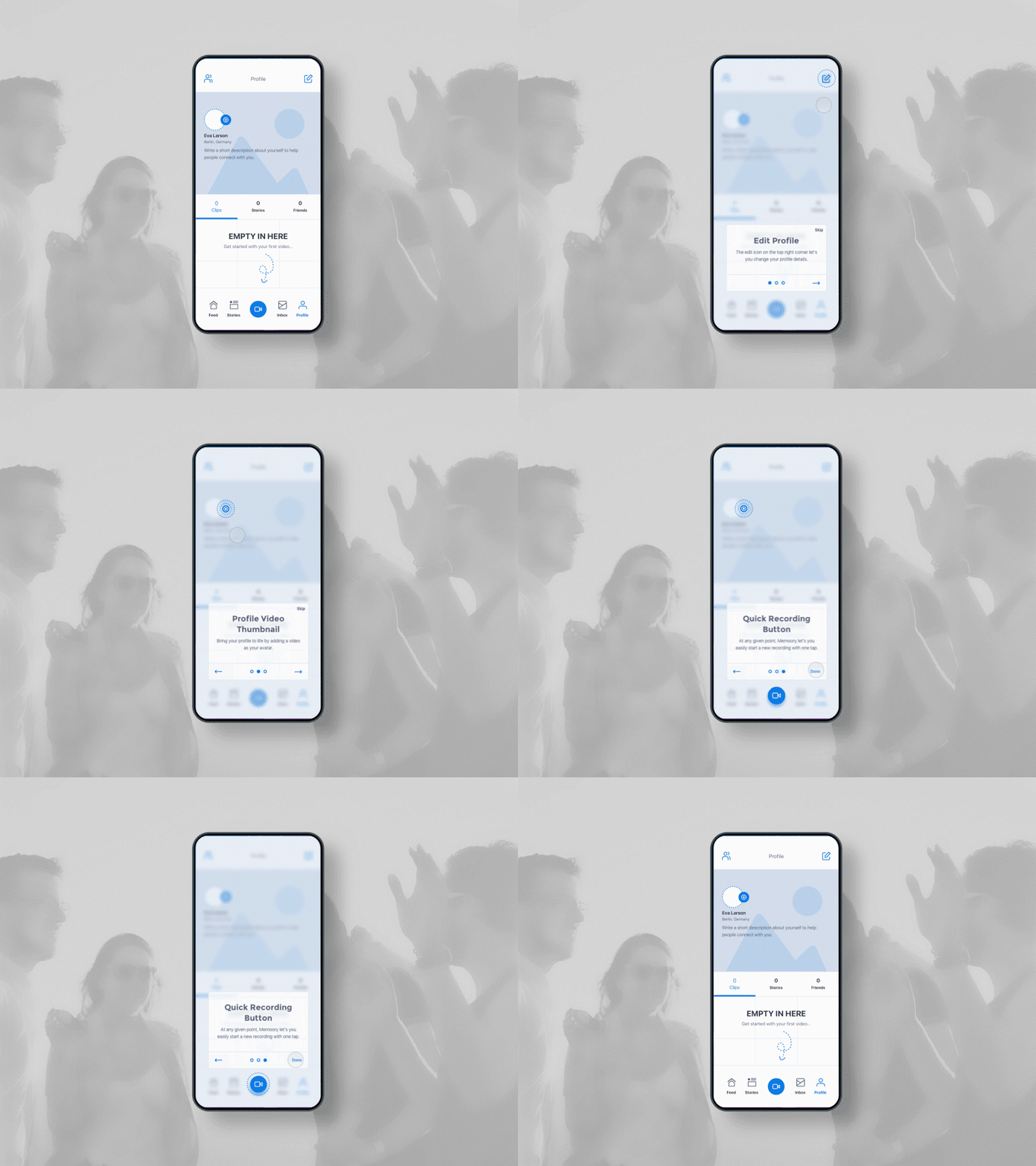
Make the first action useful
Show relevant content before introducing projects, profiles, and publishing.Capture clarity
Separate recording, review, and done
Show whether a clip is recording, ready for review, being edited, or ready to share.Social grammar
Use familiar navigation
Keep feed, messaging, profile, and follow patterns recognizable while introducing collaborative projects.

From research to implementation
01
Review the existing app
Review research notes, wireframes, flow maps, and test results.
02
Identify unclear interactions
Identify comprehension issues in onboarding, projects, recording, and chat.
03
Resequence onboarding
Move through welcome, verification, interests, and follows into a populated feed.
04
Prepare the handoff
Document screens, motion, component states, icons, and brand assets.
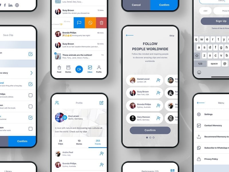
Map discovery, recording and collaboration


The final mobile experience


01. Welcome
The visual system and handoff


I would measure how long it takes a new user to find a relevant story and record a first clip, then use those results to refine onboarding.
Shipped with
CEO & CTO
Product vision and technical direction
Lead developer
Built iOS, Android, the feed, and the contributor flow
Volunteer testers
Diary studies and usability sessions
Sources
5 references- developer.apple.comApple Human Interface Guidelines: keep onboarding brief and teach through actions people can try in context.
- andrewchen.comAndrew Chen on the cold start problem for social products: make the app useful to one user before the network arrives, so the first session is not an empty feed.
- nngroup.comNielsen Norman Group's formative usability-testing guidance supports small iterative rounds for finding behavior patterns early, before design decisions become expensive to change.
- nngroup.comNielsen Norman Group's usability heuristics framed the synthesis: visibility of system status, match to real-world mental models, consistency, recognition over recall, and error recovery.
- akendi.comAkendi’s Experience Thinking framework considers product, content, brand and service touchpoints in user research.